Brand
Brand Guidelines
Our brand identity system. Use these guidelines to correctly represent QRZone.io in your communications.
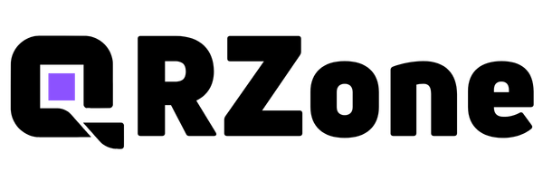
Primary Logo
The QRZone logo should always be displayed with adequate clear space and never be distorted, recolored, or modified. Always use the provided assets below.
Icon Mark
The standalone icon mark is used for favicons, app icons, social media avatars, and compact spaces where the full wordmark does not fit.
Usage Rules
Do
- Use provided logo files without modification
- Maintain minimum clear space equal to the icon height
- Use the dark variant on light backgrounds and vice versa
- Scale proportionally -- never stretch or compress
Don't
- Recolor, add effects, or apply gradients to the logo
- Place on busy or low-contrast backgrounds
- Rotate, skew, or add drop shadows
- Recreate or approximate the logo with other typefaces
Color Palette
Purple Core
#7C3AED
Primary accent, CTAs, highlights
Deep Black
#0A0A0A
Dark backgrounds, primary text
Pure White
#FAFAFA
Light backgrounds, inverse text
Muted Gray
#6B7280
Secondary text, borders
Typography
We use Inter as our primary typeface and Geist Mono for code snippets.
Aa Bb Cc
Inter Bold - Headings
The quick brown fox jumps over the lazy dog
Inter Regular - Body
const qr = await qrzone.create({ url })Geist Mono - Code